Friday, 28 November 2014

Contents page: DEVELOPMENT 3


This is the finished first draft. I then went to Helen to ask for advice on changes shown below.


After creating my CD Cover I decided to place it on my contents page, after realising there wasn't enough space I decided to shorten my editors note to make way for the CD cover. The CD cover matches the colour scheme of my magazine, making this a lovely finishing touch to the page.


This is the bottom half of the contents page complete with the two changes. I feel like this looks a lot better and gives the page more dimension.

Monday, 24 November 2014

Contents page: DEVELOPMENT 2


This is the completed colums, this shows how structurally important the red banner is, as without it, it would be visually straining to read.  


For the final column, I decided to add an editors letter, the black box is there for template purposes as this is where I will add the image of the editor. 


I then added all the text and ended up with this overall layout at first. I decided to pick a cursive font for my name at the bottom of the column to make it look as if I've signed the page. I decided to make the colun grey to help it stand out further among the text however I chose the colour grey as it was a subtly difference which also fits with my colour.


This is the development of my tagline for my magazine. I decided to chose a tagline for my contents page as I found this is a good selling technique and will also place perfect on my billboard and website helping the different formats flow. I decided to use Sans Source Pro Extra Light to contrast the bold masthead, I then added to red quotation marks for extra dimension to the page and as a pop of extra colour.


This is my first almost complete draft of the contents page however there are still some minor chages to make.

Monday, 17 November 2014

Contents page: DEVELOPMENT 1


First, I started by creating some guide lines for my contents page to make sure everything is aligned by the end of the product.


I then went on to add the logo for my magazine and a banner across the top of the page for a structured look and also to create a flowing house style in preparation for creating the double page spread.


After, I added the image of Sophie, at this point I had decided to keep the image in colour as I thought it would look better and show the Union Jack flag better however later I changed the image to black and white as I felt this fit my magazine genre and style a lot better,


I then went on to create the titles for the contents of my magazine, I started with features as this is a common convention found in both regional and national magazines. To follow with the banner on the top of the page, I decided to give the titles one also, I felt this was a good idea as it would create specific columns for my contents page and helps separate against other titles, therefore by doing this it creates a framework for the text.


I then created guides for the numbers and the text for the features column, I decided to place it down the left hand side as this would help create a divide between the other columns on the page and is also the best place, visually, to place the numbers. I decided to colour them black so the red banner would stand out better amongst the text but I placed the numbers in  different font to avoid confusion when reading.


I continued this until all columns were complete.

Friday, 14 November 2014

Double Page Spread: DEVELOPMENT 2


I completed the bottom right corner of my page under the image as shows. I created a sort of Photo Booth image reel as I felt this tied in well with the article but also added the element of difference as I've never seen something like this in a regional or national magazine. I then added an extra column of text which adds like a strap line but for the end of the article which lends to easy navigation again as it supplies more page numbers which follow the article further, this is unconventional lending itself to the regional genre again.


 Finally I placed my page numbers etc. along the bottom of the page, I chose to also add a link to the website as I find this is very typical for a teen audience magazine to entail, I also added the name of my magazine next t the page number as I felt this lent some originality but also if an audience would only see one part of the magazine they'd be able to identify where it's from, from this. I also added the date to the bottom so readers could easily find the date of the magazine.


Monday, 10 November 2014

Double Page Spread: POLAROID DEVELOPMENT


Firstly, I created a polaroid template using the rectangle tool. I decided to make it grey in order to stand out against the white background of my page.


I then added an image to the template, after adding the image in colour I realized this wouldn't follow with my house style so I then changed the colour of the image to black and white. I chose an image which again had the Union Jack background to again fit with the house style and theme of my magazine.


I then added some writing to the bottom of the polaroid as a sort of stamp as this is commonly found when images are taken in photo booths. I chose a cursive font to look like the names of the girls hd been written on by them selves and I chose a stamp font for the word 'Sirens' to make it look like it'd been stamped onto the polaroid.

Wednesday, 5 November 2014

Double Page Spread: DEVELOPMENT 1


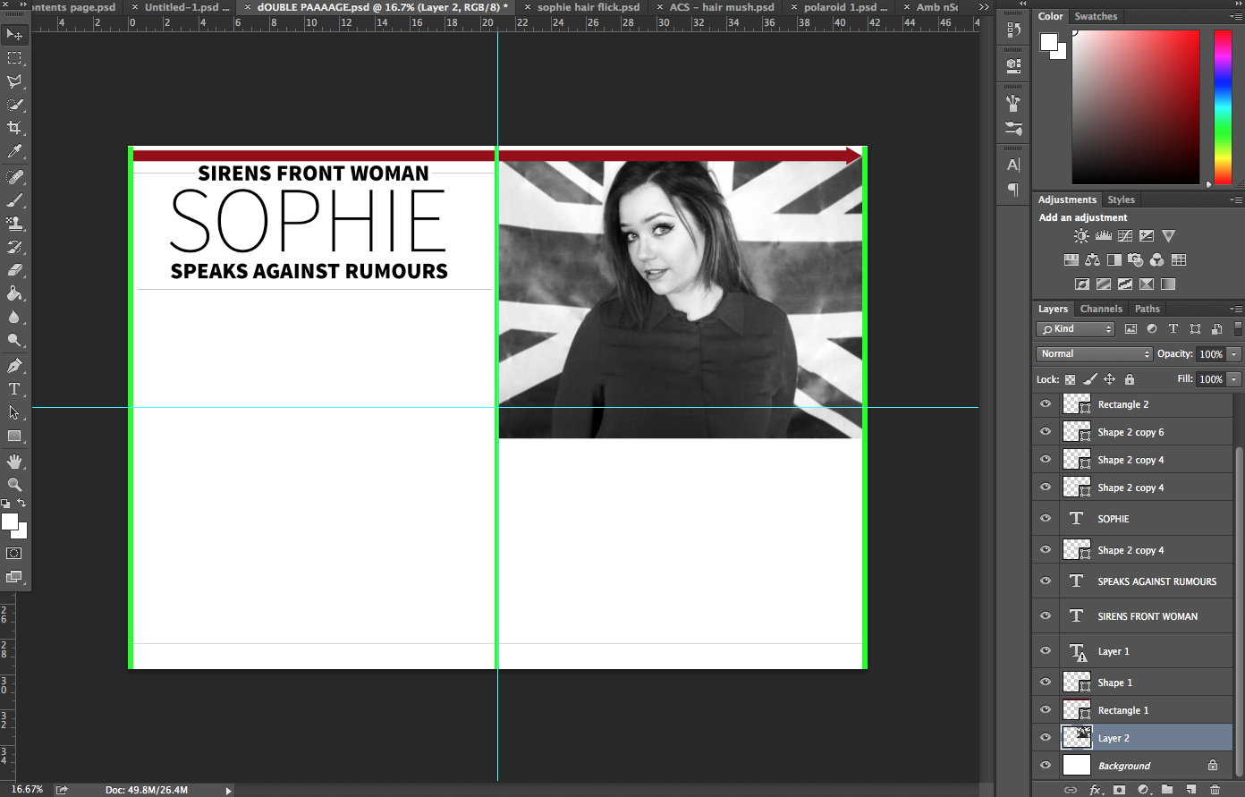
First I placed some guidelines in order to help me layout my text and images so everything would be aligned perfectly. I then added a red arrow across the top of the page using the rectangle tool in order to create a house style throughout my magazine, following on from the contents page. I chose red for the colour in order to make it stand out from the monochrome image and text to give the page a little something extra.


I then added my edited image to the page. I chose to place it in the top right hand corner as I felt this was an unusual convention in which would lend aid to the fact that my magazine is regional rather than national, I also felt this would, structurally, improve the layout for my text to follow underneath the image.


I then made a start on the title for my article, I again decided to go for a more structured look following the structural feel of my images. I decided to follow a tiered layout with my text creating a banner effect for the top of the page, I felt like the banner style was a typical convention but the tiered effect made it quite unconventional leading it to fit perfectly in a regional magazine.


Next I created some article guide lines and copied in my article, previously marked by Helen, to the page. I then chose my pull quote from the text and slotted that between the columns as this is a typical conventional place to put the pull quote and I didn't want to over complicate my page by taking too many unconventional adaptations to the page. I then added my strap line, to make it stand out I used a different font so it would stand it creating easy navigation for readers.

I also quickly added a image caption to the photo, as small details like this help make the magazine look professional and realistic.


                  IMAGE 1                                                                                     IMAGE 2

After creating the pull quote I realised that the article looked too monochrome (image 1) and it didn't stand out amongst the text too when, I changed the font slightly and added a pop of colour (image 2), keeping with the colour scheme. Folloing this I realized the article would look a lot better if I made the questions also stand out amongst the text like almost all magazines do therefore I changed the questions to bold and changed them to red which isn't shown here.


These are the fonts I chose for my double page spread, they are all a sans font and very similar but have the unique differences therefore giving them all a specific purpose on my double page spread. Source Sans Pro Extra Light and Black was used for the pull quote and article title as these were also used on my contents page adding house style but also they stand out the best amongst the other fonts. I then chose Arial Narrow Regular for my article font as I thought this is a well known font by many and is easy to read for all eye sights. Avenir Light was chosen for my strap line as I believe, again, this font is really easy to read but it also adds a little something different to the page. Typically only one or two fonts are picked for a double page spread but being regional I decided to use four, to add the element of difference and variation to my DPS.